How Color and Layout Affect Children’s Play Experience
How Color and Layout Affect Children’s Play Experience
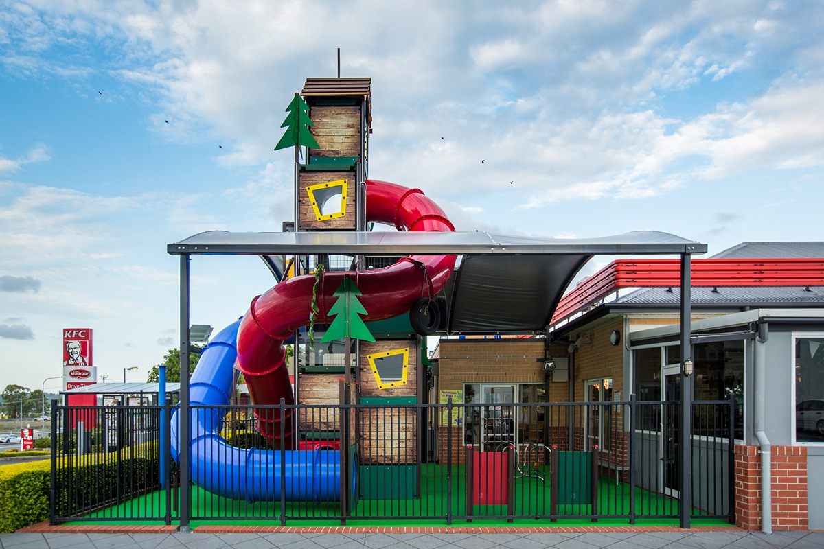
The design of a commercial playground goes beyond aesthetics—color and layout play a key role in shaping how children play, explore, and interact.
Color can influence mood and behavior. Bright shades like red, yellow, and orange encourage energy and active play, while cooler tones such as blue and green create calming spaces for quieter activities. Using color strategically can also define zones, guide movement, and ensure accessibility for all children, including those with visual impairments.
Layout determines how children move and engage. Open spaces promote group games and running, while structured zones—like climbing areas, swings, or balance equipment—help develop specific skills. Pathways, natural features, and hidden nooks encourage safe exploration and imaginative play.
Combining color and layout thoughtfully creates a balanced environment where children can be active, social, and creative. For commercial playgrounds, this design approach not only enhances safety and usability but also ensures every child enjoys a rich, engaging play experience.
Please note: The gallery wont work as a lightbox in admin mode.


